How an eSIM App Unlocked a 12.5% Conversion Boost Through Competitor Intelligence
Industry: Utility/ Mobile Connectivity
Platform: iOS

Introduction
Scaling a utility app in a saturated market is a game of inches—especially in the eSIM space, where users compare multiple providers in seconds before making a choice.
Even with healthy traffic and a polished UI, growth teams often hit a "conversion ceiling." They find themselves asking:
- Which specific visuals actually move the needle on "Installs"?
- How do we outshine established players without ballooning our ad spend?
- Can we improve conversion without the risk and cost of a total redesign?
This is where FoxData’s ASO & App Analytics solutions suite bridges the gap between guesswork and growth. By leveraging real-time App Store data and competitive intelligence, we help teams pinpoint friction points and turn "good enough" pages into high-converting assets.
💡 Try FoxData for ASO-driven growth
In this case study, we examine how an emerging eSIM provider—competing against giants like Airalo and Saily—used data-driven visual optimization to uncover hidden opportunities and drive double-digit growth.
Background
Our client, a rising eSIM provider, had a problem many developers envy: a clean, modern App Store page and steady traffic. However, their page-to-install conversion rate had completely plateaued.
The visuals looked professional, and the messaging was technically correct. Yet, users coming from broad, high-intent searches like “eSIM” or “travel data” simply weren't converting at the expected rate. In a mature category, identifying the "next level" of growth is a subtle, data-driven challenge that requires looking beyond your own backyard.
Challenges
After preliminary review, we realized we were facing a rare ASO challenge:
1. No clear “bad elements” to fixThe icon was modern, screenshots were polished, and messaging was reasonable. There were no obvious, low-hanging optimization opportunities.
2. No previous testing data existed
Because no graphic A/B tests had been conducted before, the team had no benchmark or historical data to guide decisions.
3. Traffic was broad and not easily segmentable
Custom Store Listings would not produce clean insights, as most impressions came from generic queries like “eSIM.”
4. Conversion stagnated despite strong traffic
Traffic volume was high, but page-to-install conversion refused to move.
This combination created a scenario where guessing was risky—and even small decisions could easily push performance in the wrong direction.
Solutions
To break the deadlock, our team followed a tightly structured 3-step workflow designed for “plateaued but polished” apps:
Step 1 — Using FoxData to Decode Competitor Success
To find a breakthrough, the client used FoxData’s ASO Impact Analysis to monitor the evolution of top-tier competitors. They specifically looked at Saily, a market leader that had recently seen significant growth.
By analyzing Saily’s version history, the team uncovered a critical market shift: The industry was moving from "Aesthetic Branding" to "Clarity-First" design.
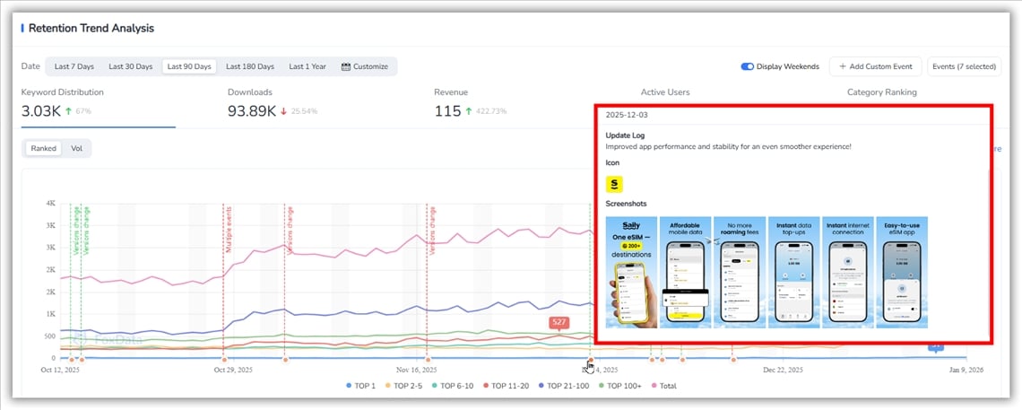
👉 ASO Impact Analysis: Turning App Store Events Into Measurable Growth Decisions
Key Findings from the Competitor Audit:
- The "Small Icon" Problem: Many apps (including the client’s) looked great in high-res but became a blue blur in search results. Saily had already solved this by adding high-contrast category cues.
- The 3-Second Rule: Top-performing screenshots didn't just show the UI; they shouted the value proposition (e.g., "Global Data") using bold, human-centric visuals.
- Trust Signals: Consistency in device frames and alignment wasn't just "aesthetic"—it was a proxy for technical reliability in a service where users are trusting the app with their international connectivity.
Step 2 — From Insight to Action — The "Saily" Inspiration
Inspired by the data-backed changes seen in Saily’s recent optimizations, the client formulated a hypothesis: Explicit category signaling would outperform generic "modern" branding.
1. App Icon Evolution: Clarity over Abstract Art
FoxData’s ASO Report showed that top-ranking eSIM apps share a "Gold Standard": Instant Category Recognition.
- The Logic: In a list of 20 search results, users click what they recognize immediately.
- The Change: Following Saily’s lead, the client ditched the abstract shapes for an icon featuring a clear "eSIM" label and adjusted contrast for better visibility on small screens.
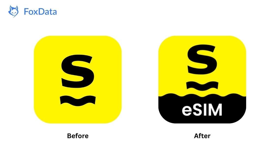
Before:
The icon maintained the brand’s visual identity but relied on subtle shapes and small text that became difficult to distinguish once scaled down.
After:
By incorporating a clear “eSIM” label and adjusting contrast and sizing, the updated icon achieved two key improvements:
✔ Better visibility in competitive search results
✔ Instant category recognition—a critical factor when users compare multiple eSIM apps side by side
These refinements preserved brand consistency while improving recognition during high-intent search moments.
2. Screenshot Refinement: Selling the Benefit, Not Just the UI
The team analyzed how Saily moved from busy, text-heavy layouts to a "Hero" style.
Market Benchmark (Saily): Notice how the "After" version uses a human hand to add warmth, bold headlines for instant readability, and a clean blue background to project stability.
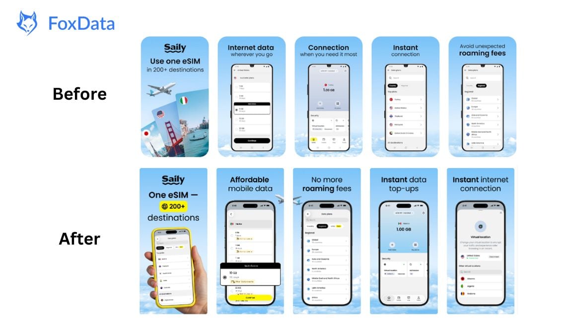
The client mirrored this strategy:
- Before: Relied on generic UI screens that didn't immediately promise "Global Coverage."
- After: Switched to high-contrast layouts, bold value propositions, and fully visible device mockups. This removed the "cognitive load" for the user, making the decision to download effortless.
Step 3 — Validating via A/B Testing
Success isn't about copying; it's about validation. The client used the insights gained from FoxData to run a 50/50 traffic split test on the App Store.
- Icon Test: The high-clarity version (inspired by top-tier competitors) yielded a +6.15% CVR.
- Screenshot Test: The "Clarity-First" layout delivered a massive +9.85% CVR.
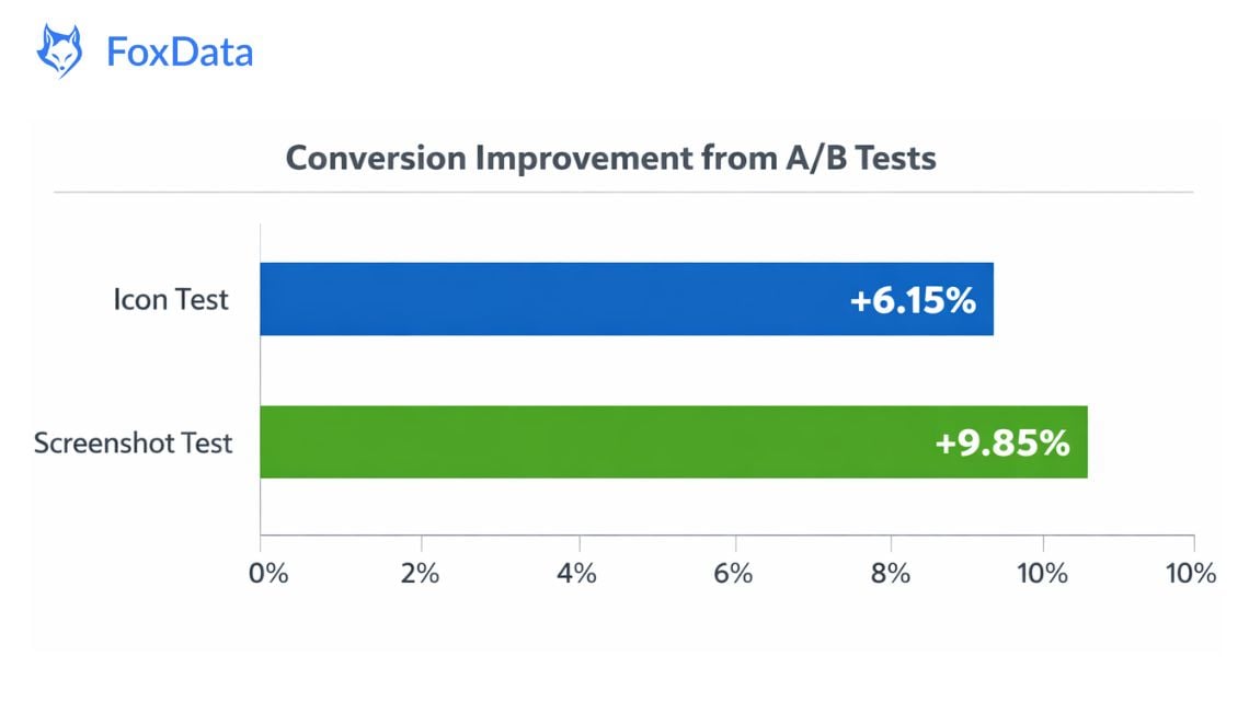
By testing these changes individually, the team confirmed that the "Industry Leader" approach was exactly what their specific audience was looking for.
Discover how FoxData enhances data protection and security standards to keep your analytics safe and reliable.
Results
After rolling out the updated visuals and analyzing equal-length periods in the Explore channel:
|
Time Period |
Conversion Rate |
|
Before (Aug 21–28) |
23.81% |
|
After (Sep 20–27) |
25.44% |
➡ Final overall uplift: +1.63% conversion
This improvement is notable given the high baseline conversion—demonstrating that even subtle, data-driven visual updates can have a meaningful impact.
Results at a Glance
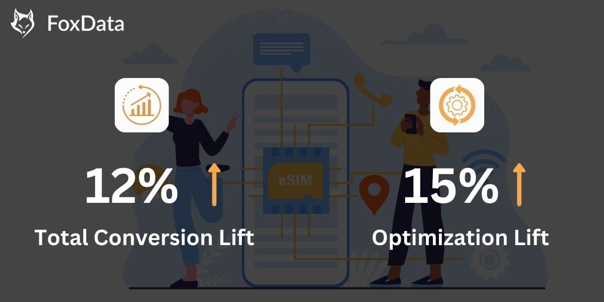
- Total Conversion Lift: +12.5% (Relative increase in Page-to-Install rate)
- Icon Optimization Lift: +6.15% CVR
- Screenshot Optimization Lift: +9.85% CVR
- Overall Explore-Channel Lift: +1.63%
- No full redesign required
Key Takeaways
1. Data-Driven Decisions Outperform GuessworkUse ASO tools like FoxData to identify high-impact areas before making changes.
2. Visuals Drive First Impressions
Prioritize icons and the first two screenshots for maximum conversion impact.
3. Copy Matters
Optimized titles, subtitles, and descriptions improve both visibility and user trust.
4. Social Proof is Powerful
Highlighting reviews and ratings can significantly influence download decisions.
5. Iterate Continuously
Small, frequent adjustments guided by analytics outperform one-time massive updates.
Conclusion
Improving app conversion isn't about being the "prettiest" app; it's about being the most "understood" app. By using a data-driven approach, this eSIM provider was able to unlock double-digit growth by simply refining what they already had.
Is your App Store listing "good enough" or is it truly optimized? Small updates to visuals or copy could uncover hidden growth opportunities.
👉 Explore FoxData’s ASO Tools or reach out to our team for a personalized strategy.


